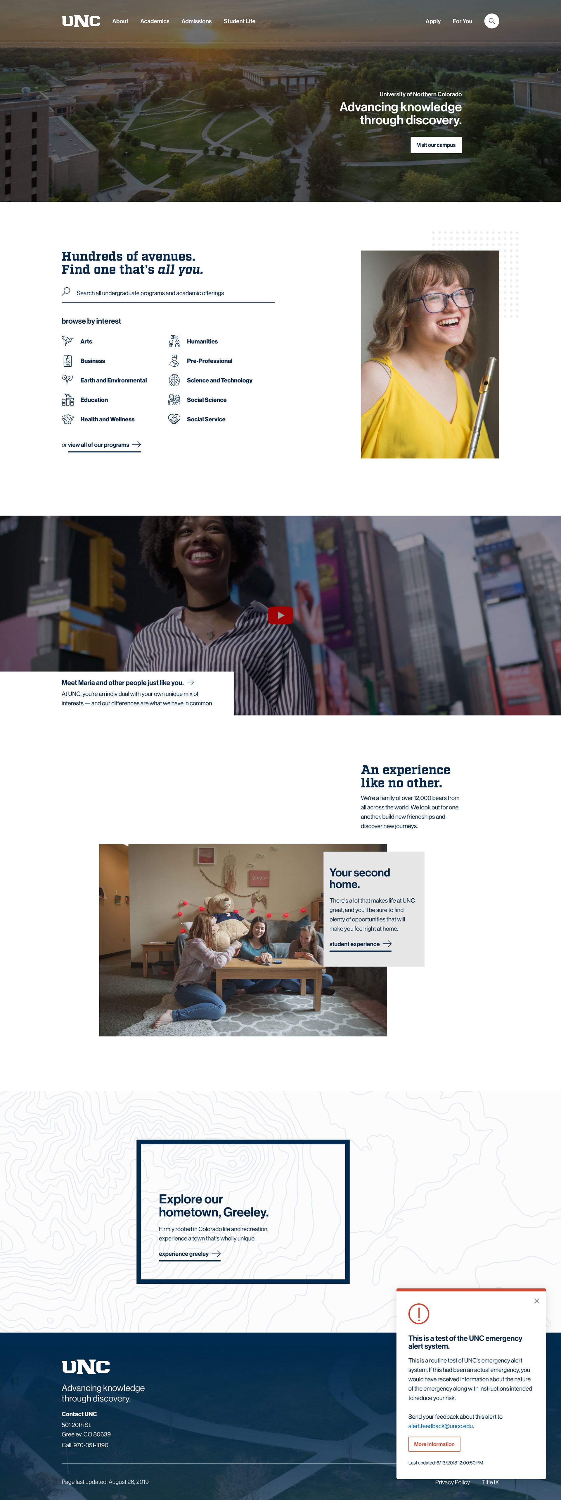
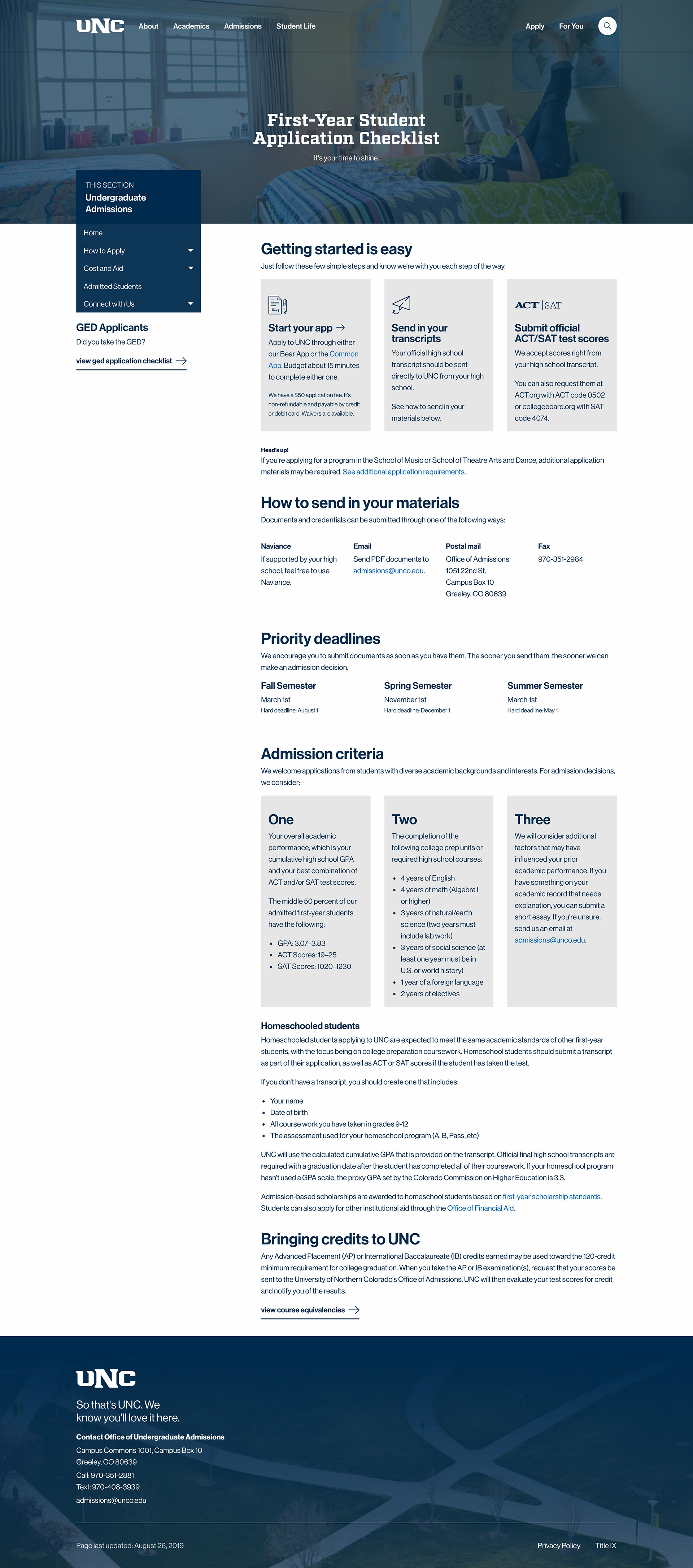
Website refresh
I began working on a "secret" refresh for all UNC web properties in early 2017, devoting many weekend hours to a handful of high-fidelity mockups that were helping me refine my skills.
This far-fetched idealization of what I envisioned the future of our website to be became fruition in mid-2019 as the marketing advancement team was looking to refresh the site for the new recruiting cycle.

~*~*~*~
Email marketing
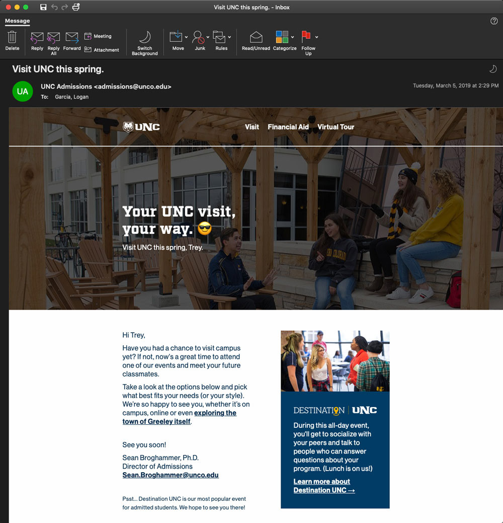
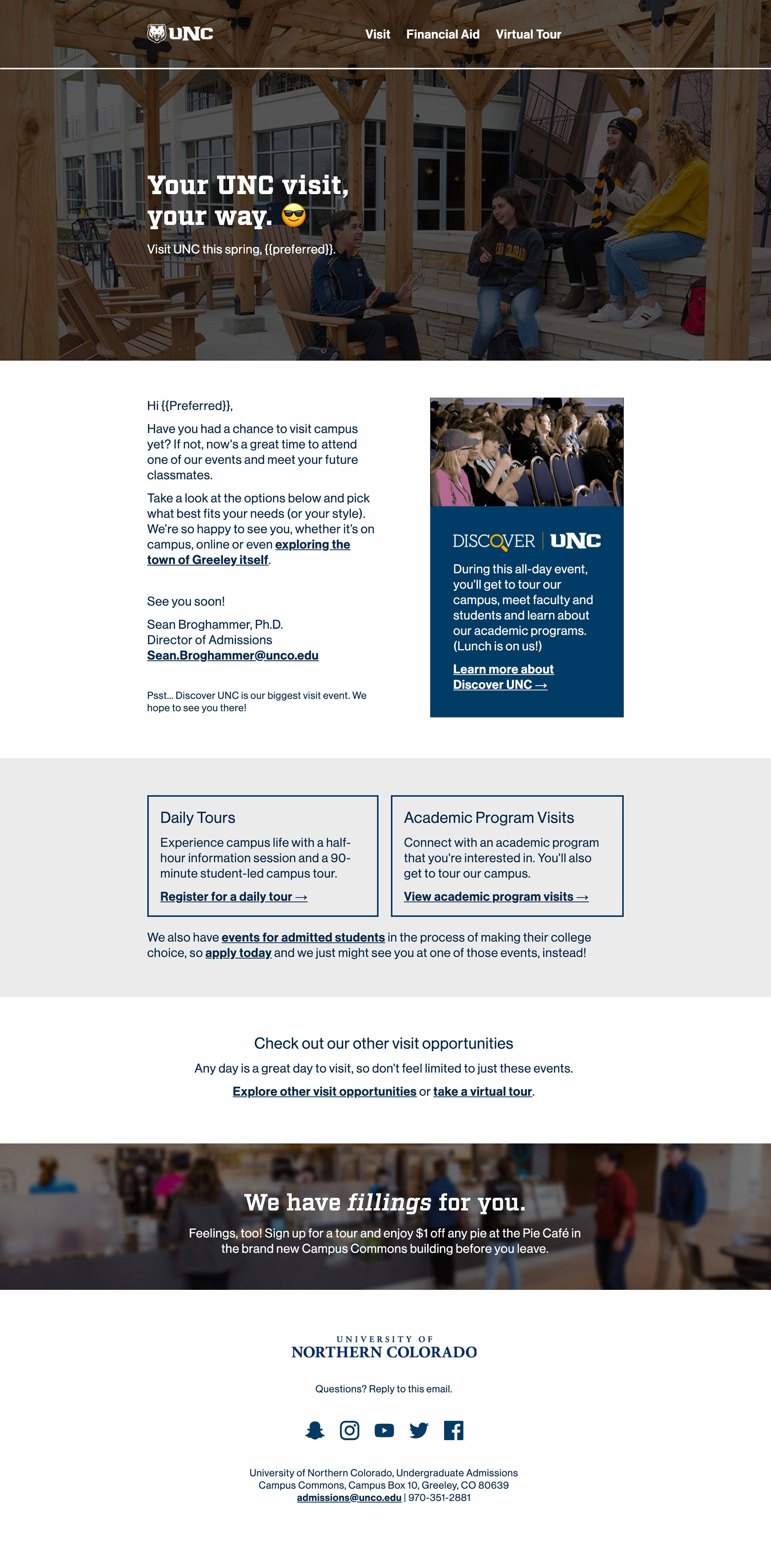
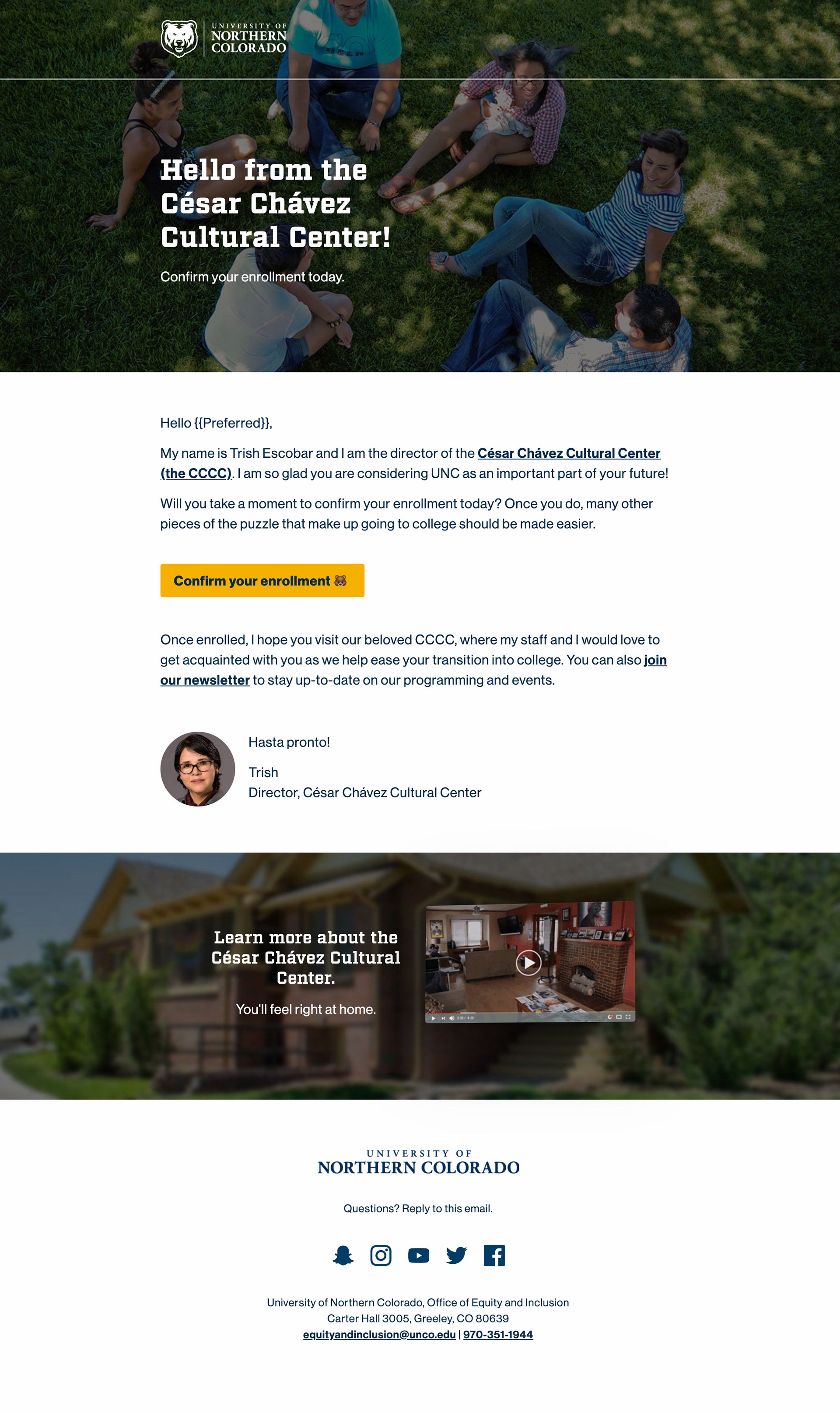
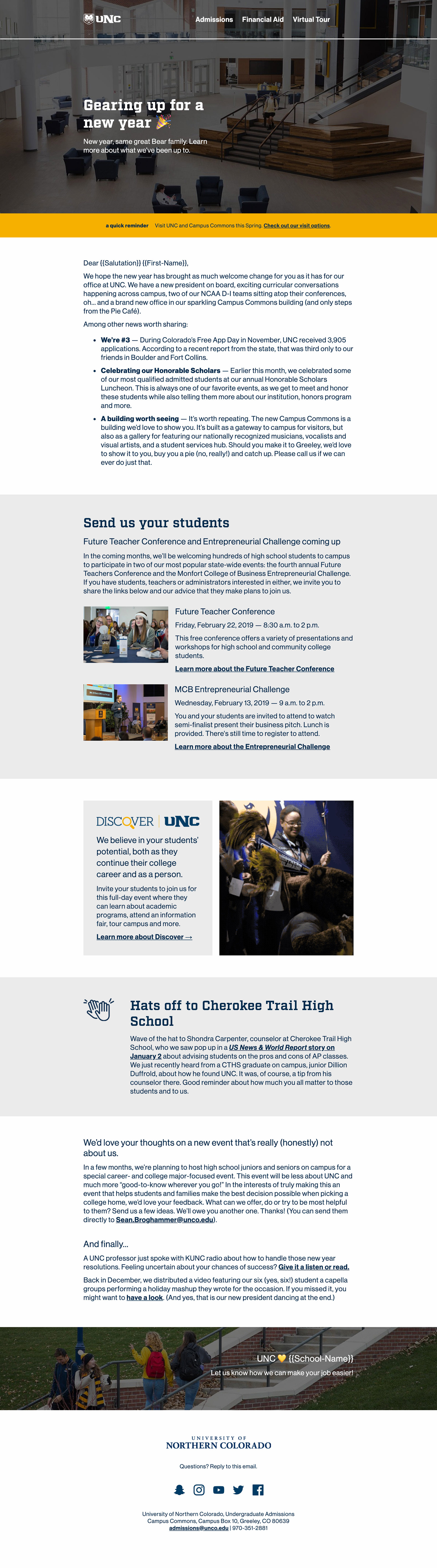
After we moved away from Oracle Eloqua, we needed a new design system for email that was responsive and easy for non-coders to manipulate.
Enter: a new email framework that's consistent in design with my web overhaul (see above).
These designs are built on top of Zurb's email framework and use a number of custom components for Outlook-compliant, full-width background image rows and callout boxes.
After planning, building and inlining, an empty email template gets pushed through Gulp and imported into Slate. This workflow allowed me to create one template for each email campaign segment, leaving marketers to enter content and swap out photos.
~*~*~*~
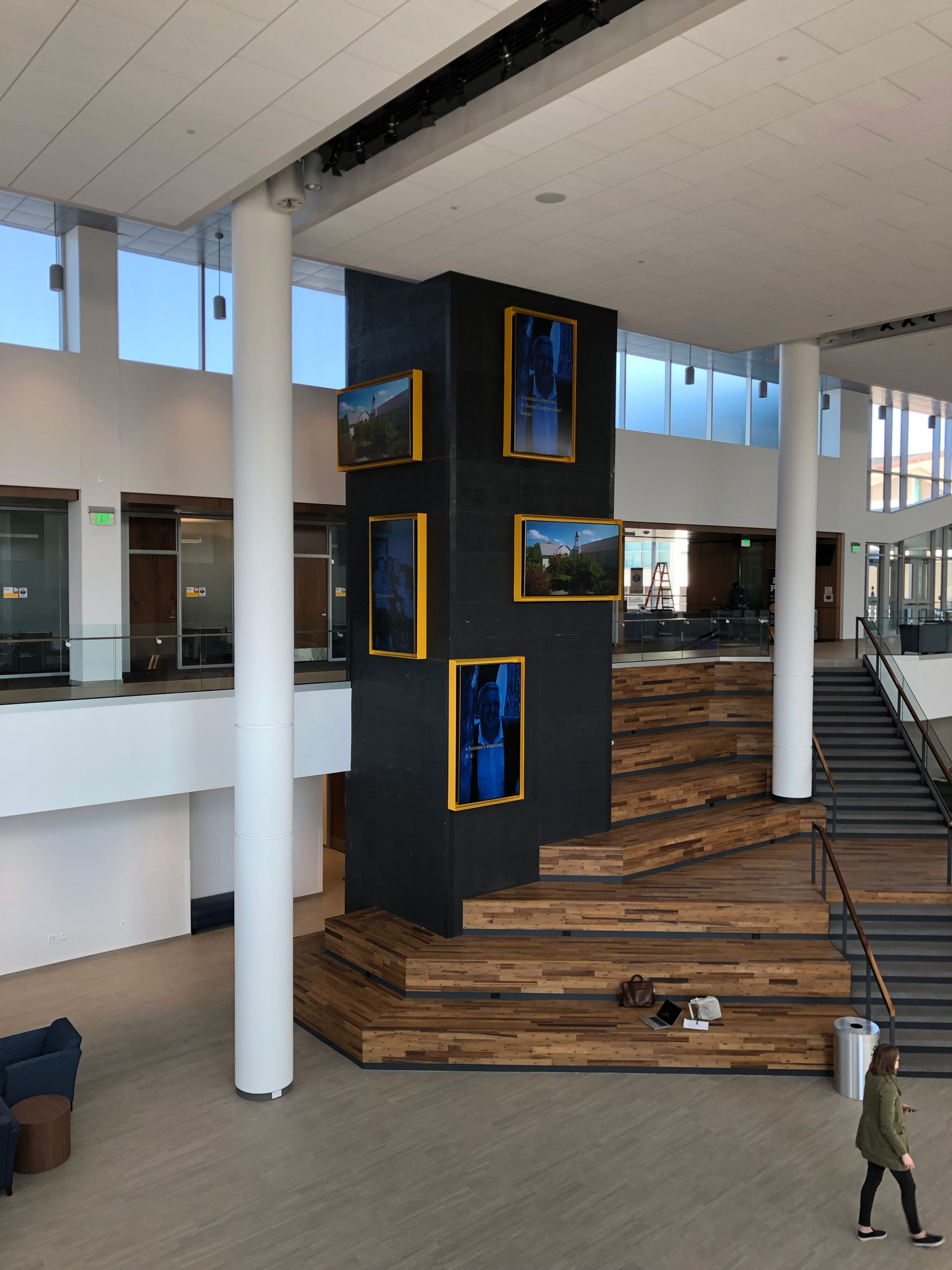
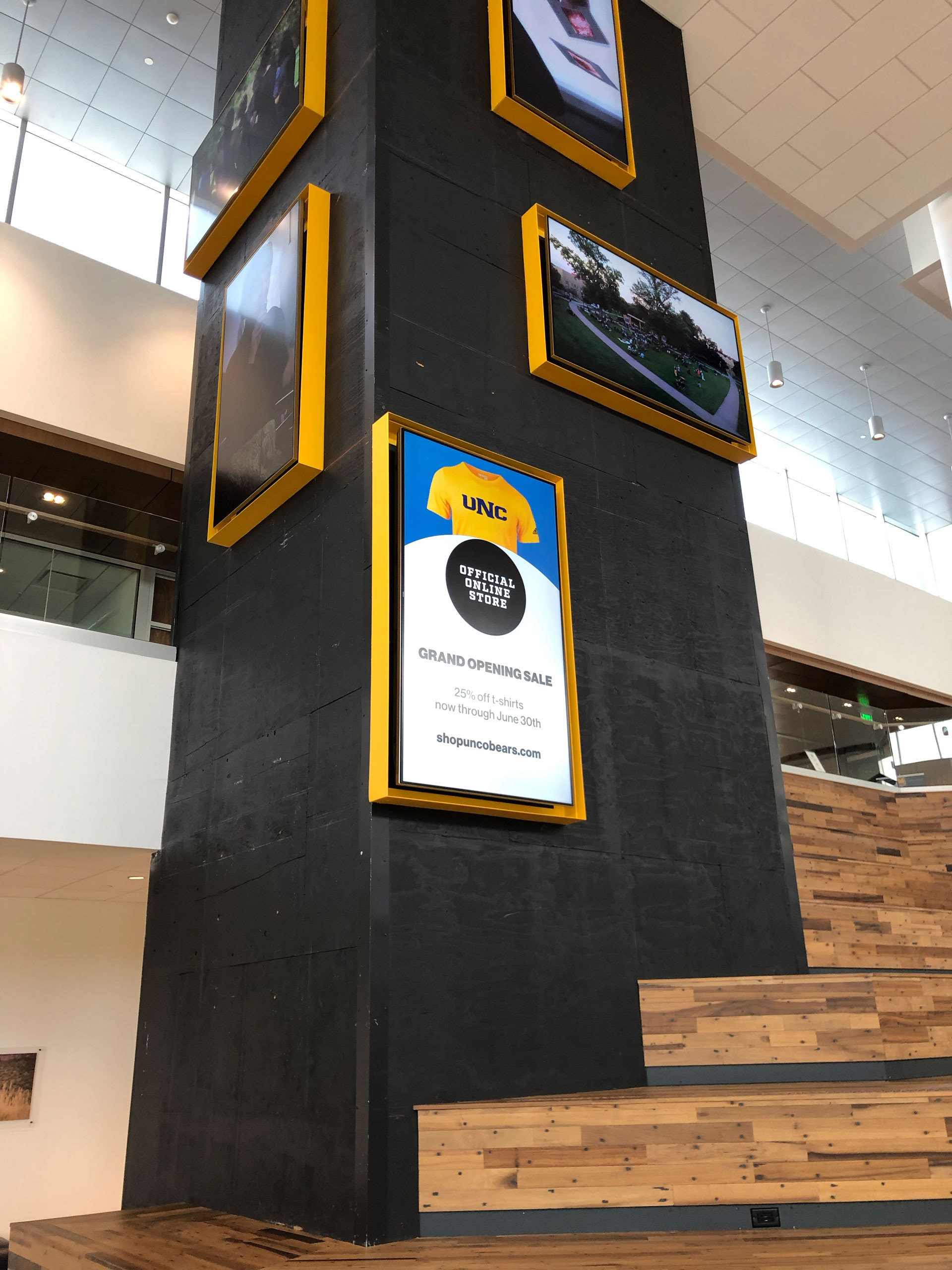
Digital signage
UNC used two digital signage systems: Elementi by Spinetix and the FWI Cloud. While I was trained in both systems, I primarily made content changes to the Spinetix systems (campus partners were able to make their own changes using the FWI Cloud).
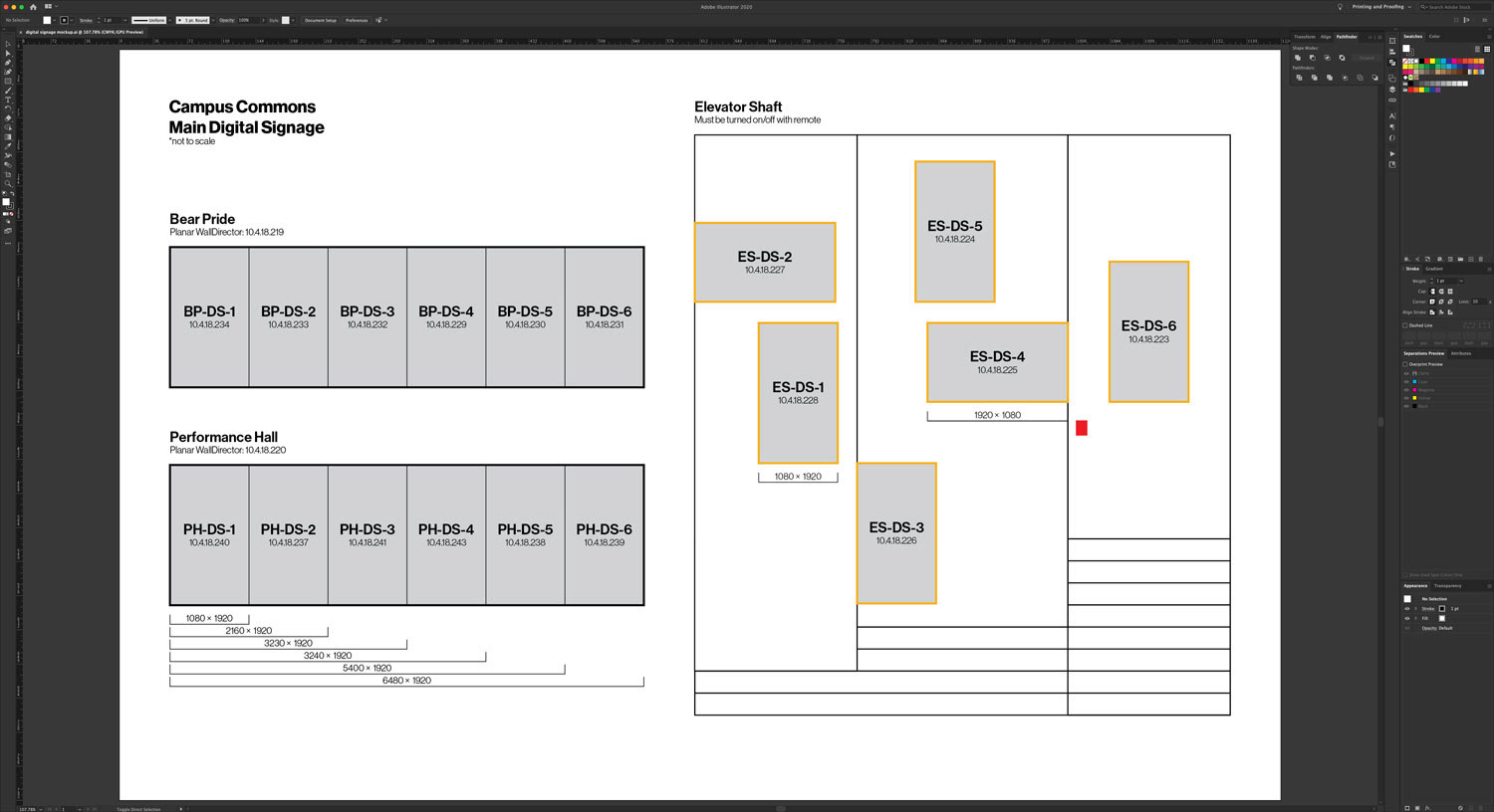
This spec sheet became indispensable when scheduling content and talking with campus partners about their digital signage needs. It allowed others to see the general locations of the screens in relation to each other and made it easy for others to design content to spec.
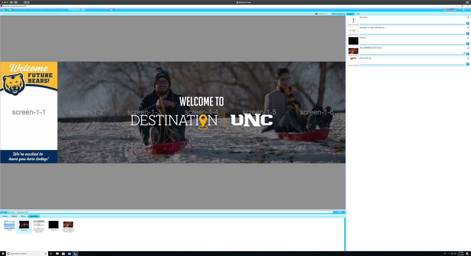
A simple design (consisting of the rotating list of names and a video) makes it easy to quickly customize content for special events. Planning natively in the software instead of importing flat image files allowed us to reuse layouts.
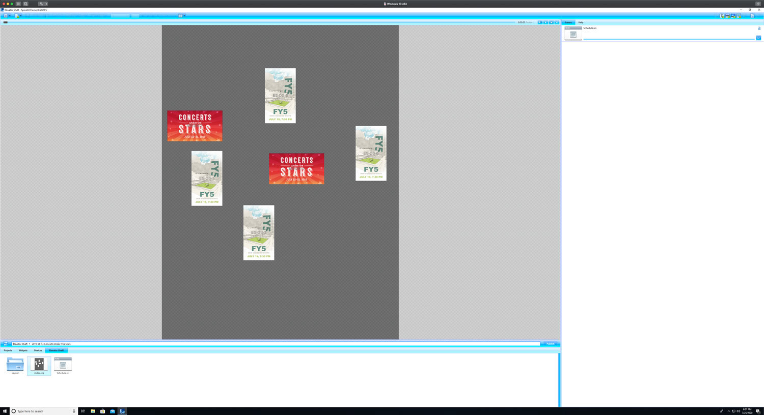
The vendor said it wasn't possible to have all displays on the elevator shaft in one project, but given a few hours and the CAD files, I was able to create a pixel-perfect translation in the software.
~*~*~*~
CREDITS:
"Welcome Future Bears" graphic and event logos
Wendy Brookshire
Wendy Brookshire
Photography used throughout
Woody Myers + Co.
Woody Myers + Co.
Videos used in website mockup and in animated GIFs for emails
Andrew Warren and Joy Andrews
Andrew Warren and Joy Andrews
Project copy
Rebecca Dell and Deborah Moors
(adapted for web by me)
Rebecca Dell and Deborah Moors
(adapted for web by me)